Here’s My final Process book of my Movie poster (It’s time for coffee!)

Click image above! You will be automatically connected to My store 🙂
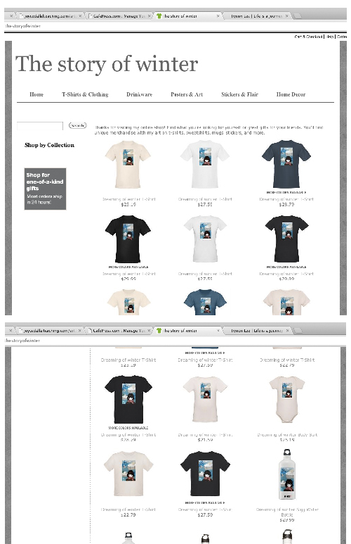
I opened the online store! You can see various items with my vector design.
Here’s some image of my online store.

Here it is 🙂 I completely changed my theme of movie poster after 1st critic, because I put too much illustrator files, so it didn’t look like a movie poster. So I decided my new theme about coffee. I mixed the true history and fiction. It’s about that when american introduced coffee to korean, there were various happening because of that. Some people didn’t like coffee because it looked like a poison, some people liked because of new taste. Anyway, Story concept is that some funny happenings between american guy who want to spread the taste of coffee and koreans who first taste coffee in the 1900s. The movie genre is comedy but also adventure and little drama. Target audience is all ages who are interested in korea or coffee.I used Hunminjeongeum (Korea historical document which may give more sense of old mood of Korea) and blue texture which contrast to Hunminjeongeum’s warm brown color as background.
Logotype : Vintage one font. Just like the font name, it gives sense of vintage. The Font design also has shadow of each alphabet, so It makes people to catch the title easily.
Illustration : I traced a tuxedo photo in illustrator, so It emphasizes the body of man which is main thing of the movie poster.
Overall, I’m not 100% satisfied with this poster, but I’m happy with it.


It’s really fun to research various posters to get an idea. I can do this all day 😉 hahaha. Different compositions of poster, interesting calligraphies, and colors…I prefer simple and vintage designs, so my poster design will be something like that.


It’s just sketches… I used ipad to draw these. Haven’t decided clear theme of a movie poster, but consider between youthful enthusiasm and love.

Here’s a new header of blog. Including pattern, vector drawing that I worked. Definitely It’s better than old one.

It was fun to learn how to make pattern by using alphabet. I will try something with Korean next time 🙂

Illustrator Type Cheat Sheet 🙂
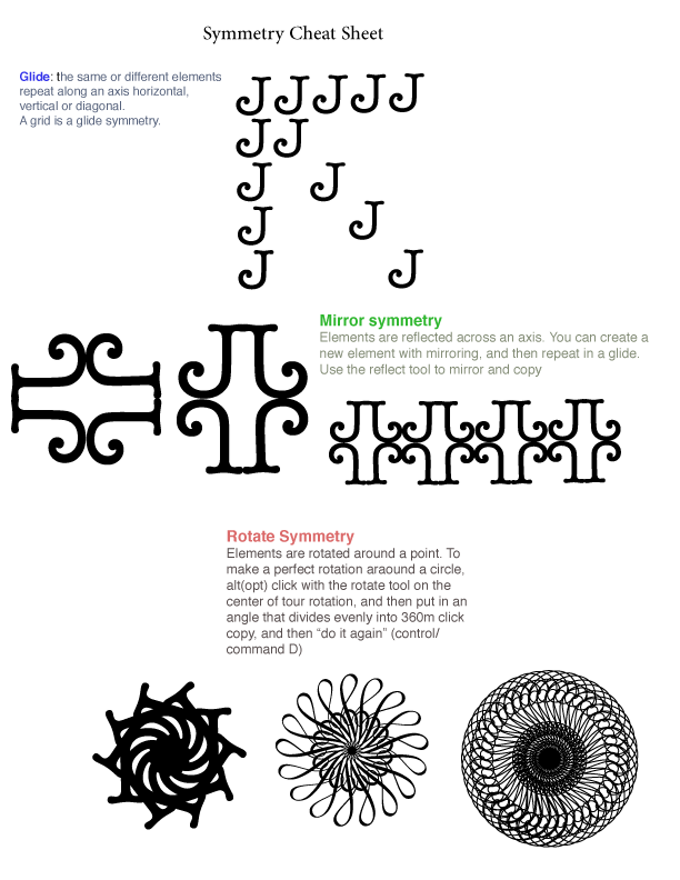
Symmetry Cheat sheet.

Here it is!!!!! Spent so much time to finish this work. phew! However, It’s worth it 🙂
Since I came LA, It’s been over 2 years that I couldn’t see snow. That’s why I choose the concept of final about winter and north pole.
+
Update. Edit. Real final version. (13.10.12)

Before I edited it, I left a tree without shadow, because the theme of this poster is the dreaming of winter. Therefore, I thought there must be something which doesn’t belong to other things like dream that I often have. In a dream, anything is possible, and kind of makes it sense. However, my friend told me that it would be better if a tree has shadow too like other things for harmony of the poster, so I added a shadow of tree. and I’m happy with my result 🙂
| deenaozaki on Mask |
